Sunday 15 April 2018

What have you learned from audience feedback?


Feedback i received was verbal feedback from people after they had seen the film when it was finished. This was not ideal but we couldn't show anyone beforehand because it had taken longer than expected to edit and upload. Looking back it would've been beneficial to get some constructive criticism before it was finished in order to fix the problems.

However, when it was uploaded i gained some verbal feedback. I asked some questions about the film. First i gained their first impression. Then i asked a few questions:

Can you identify the genre?

How did you identify it?

What did you find interesting?

What would need to be improved?


The main criticism was that it wasn't easy to see what the plot was, even though it was identifiable as a horror the plot itself was too ambiguous.When you make a film it's hard to see how the audience will interpret it even though you know what is going on,the audience may be confused.

The majority of people could identify that it was a horror film. They said it was identifiable by the music and the hooded figures as they were typical of the horror genre. 

Some good points that were identified were that the film was still a horror without being overly gory and there was also a comment that the lack of dialogue was a good choice as having words may have made it look amateurish. 

There was a mixture of opinion over the ambiguity. On one hand, some found that the ambiguity made them think about what was happening but on the other hand, it was overly confusing and the plot was hard to follow.

After this, I re watched it as an external viewer and agreed that it was confusing however, I'm not sure how it could be made clearer without changing the whole film entirely although, film should be open to audience perception so that it can be more relatable to the individual.


In what ways does your media product use, develop or challenge forms and conventions of real media products?


We intended 'Infernum' to be a Gothic horror. Our intention was to create something that used typical conventions of the genre so that it is instantly recognisable to fans but also challenging these conventions in order to be unique and attract new fans to the genre. We also want to challenge a trope in all sub genres of horror that mental illness makes people evil and reverse that into the evil is the mental illness.

Here are a few tropes of the Gothic genre:


We first decided on Gothic as a sub genre because we wanted to make a short film that was unique and allowed room for creativity where as a genre such as zombie or paranormal is more restricted on what can be included and the kind of plot they have. Many horrors in these genres have similar or borderline identical plots.

However when we began to plan our film, we discovered that there were many crossovers to psychological horror, rather than physically scaring the audience through gore or jump scares, the fear we aimed to create was internal. Mentally scaring the audience by causing suspense and dread.

Our first way of emulating a Gothic film was through costume.


This image is two screenshots from the film. This shows the costume of our main character, we looked at Gothic films such as the woman in black and noted its success we then decided on a Victorian era costume, this was done by purchasing a long black skirt and a black shirt with frills on the front. Our film is ambiguous therefore this allowed us some room with the costume meaning it does not necessarily need to be historically accurate. In terms of costume, we were using typical conventions but mise en scene on the whole is a combination of typical conventions and a development of existing ones. For example, the child's toy is not typical of a Victorian toy but would be recognisable to a modern audience.


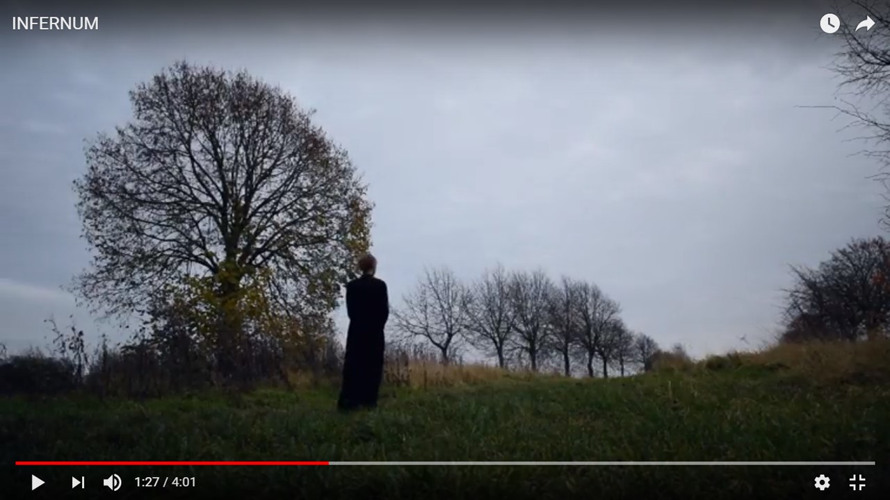
A typical theme in Gothic is the fight between dark and light how the character transitions morally, from one to the other. These shots visually hint at the characters potential transition from darkness to light, this also ties in with the psychological aspect of our film. Our film tries to show 'Light at the end of tunnel'


The transition from the dark and crowded trees to the light and airy grass suggests the transition from being low as possible in this case suicidal to confronting and accepting your problems


We wanted our film to be unique, but even with some unique aspects its impossible to not conform with some parts of a genre. In this case we looked at our demographic. Horror fans know what they like, it would be too difficult to advertise something as Gothic if it did not have any of the features of a Gothic horror, it would turn fans of the genre away therefore, we have taken inspiration from films such as The Woman in Black and see in it what we think made it Gothic and equally successful. As well as this, I found out that many horror films reflect societal issues at the time of release. For example, found footage films deriving from fear of the rising 'big brother' age. With Infernum, we chose to highlight mental health but in a way that wouldn't stigmatise the individual. Gothic horror is typically based on romance or the paranormal and this is where we challenged the conventions on the Gothic aspect. But it fits in with the psychological genre.


When we were in the editing stage we deliberately made the film darker, this is because early Gothic horror would have been in black and white, therefore we are still keeping some traditional aspects but giving it a modern twist. The fear in our film is not physical and is made through suspense building inspired by Hitchcock's Psycho. Personally i prefer this to frequent jump scares. The image above is a close up of the main character, therefore we see her reaction before we see what is happening creating suspense in the audience and her expression suggests she is fearful evoking that feeling in the audience if the character is as relatable as we intended her to be.


How did you use media technologies in the construction and research, planning and evaluation stages?


The majority of research was done via the internet. Much of the tropes of the genres can be found online in list form. This showed us conventions; what we should include in our film in order to appeal to our target audience as well as lists of classic films in our genre. Therefore, letting us see what fans of the genre look for in a film. However, many of the lists and articles online are subjective and generally opinion of the author so this became time consuming due to having to 'cross reference' them and get an overall opinion. The lists of films were helpful but there was some issues when trying to find certain films for example, on things such as Netflix, it is hard to find a lot of older and less well known films especially in the horror genre as it doesn't appeal to as large an audience as comedy. Modern technology does make visually amazing films for example, the ever growing advancements of CGI but, it has not made it any easier to find less popular/ more obscure films and film genres 


When we were filming, we were able to use a high quality camera and stabiliser. This made our shots look more professional, with a shaky camera it would look wrong for the genre and mood we were trying to convey. This also helped when creating the ancillary tasks, the images looked sleek like they would on an actual poster or in a magazine. 

We used software on the mac called final cut pro to edit our film. This caused us some problems as it is difficult to use at first, the macs also run slow for the editing we needed so it did become tedious at times. However, we were able to do what we had originally envisioned such as creating a blue, washed out filter to create a cold feeling, changing from shallow to deep focuses and editing separately filmed parts together. When the film was (finally) finished we discovered that it would not be simple to upload. We were told the resolution was too high and would have to be downgraded in order to upload. After doing this, the film lost some of the clean cut, quality that I loved about our film and that is where technology failed us the most in the project. For the ancillary tasks, I used a programme called pixlr to edit my photos and create the poster and article. For me, this was easy as I have used it many times in other projects and just to experiment with, it is useful that all of the editing i need was available for free online when many other editing software is only available when downloaded and paid for.

In the evaluation stage (and throughout the project), everything was documented on blogger. This is a site i have grown to like, at first it was incredibly difficult to use and create the layout i wanted to after a while, i began to appreciate having all of my posts in one place, this is the place I was less dependant on technology. However, i was using the print screen button to take direct screen captions from our film from you tube and the exporting the print screen to became a jpg. In comparison, this is a piece of cake to what was done in the construction stages.

During the project, I have learned that the best way to use new technology is to experiment with different aspects of the programme eventually you learn how to use it and make something you want to and not be limited to how much you know about how the programme works. I have also learned that i can get very frustrated when faced with slow working computers and definitely need to learn to be more patient.


Monday 9 April 2018

How effective is the combination of your main product and ancillary texts?


It's important that the ancillary texts and film look like they belong together. Having similar themes and images for example. If they do not look similar it will seem to lack professionalism as if there was little thought put into all aspects of the film. The ancillary tasks will be used to attract audiences to watch the film so they cannot be misleading or confusing to the viewer.

All film posters are relevant to the movie they are advertising. Even if the image is not directly taken from the film it will show a clear link between the two.

For example

From the films 'Halloween', 'The Silence of the Lambs' and 'Dawn of the Dead'

The images used on the poster are not direct screen grabs from the films however, they are still instantly recognisable that they belong to their own film. For example,'Halloween' is a classic 80's slasher and the poster demonstrates this through the inclusion of the mask on the cover. It is a very obvious link,  if the image is too random or is too much of a metaphor it can have the opposite effect.

My poster has direct similarities to the film.


The screenshots from the movie, show up close shots of the children's toy and the main characters hands. Which are featured as the main image on the poster, a direct visual link to the film. The purpose of a film poster is to intrigue audiences and attract viewers therefore, the poster needs to represent the film otherwise the audience will feel misled and this is done effectively if similar images are used in both.


A even more direct link is the title of the film. This is used in the poster, article and film in the same font. This can be an even more effective link if used with similar images as it shows the level of professionalism such as the flames on the background of the credits and poster


This is also another link between the poster and film that is more hidden. In the background there are slight blue flames in the background which links to the scene in the film where the hooded figure is setting the toy alight over a fire. This gives more of a hint to the possible plot of the film and adds to the horror movie conventions used                                       in a poster.


The article also features 'Infernum' in the font used in the film and poster. As well as this, the same font is used throughout the article. There is also the same colour scheme used, a dark and blue tinged filter over the image and black and white font is used, this connects the article with the poster and the film. The biggest link between the film and article is the image itself.


The image used in the article is a screenshot from the film. Although, this doesn't directly link with the poster but this was done deliberately so that the image used on the poster wouldn't be overused and lose impact. Its also typical of film articles to use screenshots from the film However, it is usually an image                                     that does not give away any                                         spoilers.

     When used together, the poster and article promote the film to audiences. The demographic that 'Infernum' is aimed at is 15+ young people or big fans of the horror genre. It may be more likely that younger people will find out about the film through social media posts such as movie trailers or celebrity fans or stars of the genre whereas dedicated horror fans are more likely to buy magazines specific to the horror genre and see the article there or see the poster in the magazine. 


Thursday 5 April 2018

What have you learned from audience feedback?

Feedback i received was verbal feedback from people after they had seen the film when it was finished. This was not ideal but we couldn...