It's important that the ancillary texts and film look like they belong together. Having similar themes and images for example. If they do not look similar it will seem to lack professionalism as if there was little thought put into all aspects of the film. The ancillary tasks will be used to attract audiences to watch the film so they cannot be misleading or confusing to the viewer.
All film posters are relevant to the movie they are advertising. Even if the image is not directly taken from the film it will show a clear link between the two.
For example
 |
From the films 'Halloween', 'The Silence of the Lambs' and 'Dawn of the Dead'
The images used on the poster are not direct screen grabs from the films however, they are still instantly recognisable that they belong to their own film. For example,'Halloween' is a classic 80's slasher and the poster demonstrates this through the inclusion of the mask on the cover. It is a very obvious link, if the image is too random or is too much of a metaphor it can have the opposite effect.
My poster has direct similarities to the film.    
This is also another link between the poster and film that is more hidden. In the background there are slight blue flames in the background which links to the scene in the film where the hooded figure is setting the toy alight over a fire. This gives more of a hint to the possible plot of the film and adds to the horror movie conventions used in a poster.
 The article also features 'Infernum' in the font used in the film and poster. As well as this, the same font is used throughout the article. There is also the same colour scheme used, a dark and blue tinged filter over the image and black and white font is used, this connects the article with the poster and the film. The biggest link between the film and article is the image itself. 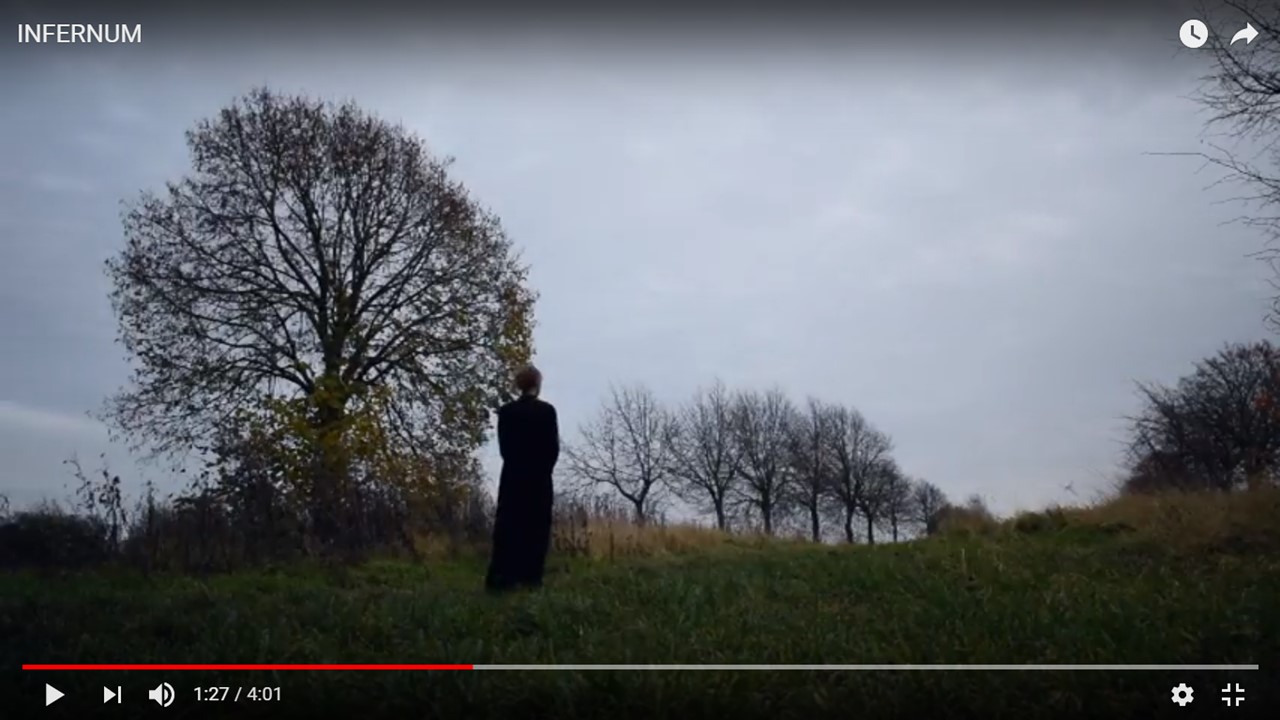 The image used in the article is a screenshot from the film. Although, this doesn't directly link with the poster but this was done deliberately so that the image used on the poster wouldn't be overused and lose impact. Its also typical of film articles to use screenshots from the film However, it is usually an image that does not give away any spoilers. When used together, the poster and article promote the film to audiences. The demographic that 'Infernum' is aimed at is 15+ young people or big fans of the horror genre. It may be more likely that younger people will find out about the film through social media posts such as movie trailers or celebrity fans or stars of the genre whereas dedicated horror fans are more likely to buy magazines specific to the horror genre and see the article there or see the poster in the magazine. |

No comments:
Post a Comment